Friday, October 17, 2014
Saturday, October 4, 2014
The number of firms and magic numbers
In business literature you can find claims about magic numbers in management. The number of ten is said to be where a firm starts, while anything below that is a team and needs a different approach. One hundred employees are the milestone where the CEO no longer knows her employees personally and corporate politics emerges. And so on.
Management depends on the size, of course. But the data points at no specific critical numbers. The histogram of firms by the number of employees:

And the log scale:

If ten or any other number had any significance, we'd see abnormal behavior around it. Management experiences transitional difficulties and some firms disappear. It would look like discontinuities or multiple peaks, as with the middle income trap. But the distribution does not support this claim. Perhaps, specific numbers matters for certain subpopulations of firms, for instance, the IT industry. In that case, it'd be interesting to look at the data. But until that it would be overall great if authors were more responsible and back their statements with minimal evidences.
Management depends on the size, of course. But the data points at no specific critical numbers. The histogram of firms by the number of employees:
(hat tip to Jeffrey Groen at the BLS for the data)
And the log scale:
If ten or any other number had any significance, we'd see abnormal behavior around it. Management experiences transitional difficulties and some firms disappear. It would look like discontinuities or multiple peaks, as with the middle income trap. But the distribution does not support this claim. Perhaps, specific numbers matters for certain subpopulations of firms, for instance, the IT industry. In that case, it'd be interesting to look at the data. But until that it would be overall great if authors were more responsible and back their statements with minimal evidences.
Wednesday, October 1, 2014
Learning obedience

Back in the 90s, growth economists explained income differences among countries with human capital (Mankiw, Romer, and Weil, “A Contribution to the Empirics of Economic Growth”). Formal education was a typical proxy, with either fraction of educated population or years of education entering regressions.
The human capital story had to integrate the institutional component since then, but formal education remained correlated with national output. One channel or another, nations have to have good education to develop.
Universal formal education came from governments in the 19th century. Peoples actually thought it was a bad idea. They cared more about what is now called social security, unemployment, and inequality.
"Universal," however, typically meant "compulsory." The reason is suggested in the first graph (taken from Alesina and Reich, "Nation Building"). Each time the French rioted, European rulers reformed education in their territories. The education system helped keeping children busy with the "right" thoughts and reduced the risk of insurrections. It didn't help European monarchs for long, but the habit remained. Say, "education" is still the most popular issue in the US Congress bills.
While many are concerned, no one started asking children what they would like to learn. Sparse surveys (like the one by NYC or Gates Foundation) ask typical satisfaction questions—the ones that ensure you don't protest much in the classroom. Authors don't question the curriculum. Questions about biased history classes would be outer space, but no survey even asks "Do you want to learn biology?"
So, education is really sacred, unlike any other services on the market. You are supposed to spend ten plus years on being good at things you don't care about. It's like a 20-year mortgage, but here they also take your time.
Any hope? If 100 years ago the factory-like training in the school produced suitable workforce for real factories, now employers expect more flexibility from hires. Mainstream technology becomes skill-biased and requires from employees to be "quick learners." Employers in competitive industries have to respond. And maybe this new demand for quick learning will change the education system more than democracy did in the 20th century.
Monday, September 29, 2014
Private sector and economic development
Failures of development programs for Africa led to the opinion that tens of billions of dollars are just wasted. This belief is very comfortable to the small-government types. The evidences seemingly prove something about ineffective governments. The favorite ideological conclusion predicts that the private sector would eradicate poverty if foreign governments reduced their involvement in Africa.
But the private sector was there for the last 10,000 years. It didn't succeed at all. And there's no reason to expect anything else. The history of economic development is the history of governments building suitable conditions for the private sector to work. In fact, we have stories of economic growth without private sector (the Soviet Union's output more than quadrupled in 1917–1991) and no stories of growth under small government.
The private sector is necessary but not sufficient for improving Africa's performance. Free markets degenerate into monopolies once some market participant gets ready to capture political power. Monopolists select the government. This clientelist government serves the interest of the few, and under some mutations appear as single-party dictatorships or oligarchies. Latin America's past is full of these examples.
The worst enemy of the private enterprise is businesspeople who say that they'd be better off without the government. Maybe some of them will, but at the expense of private businesses in general. Kinda class enemy within.
Economic development consists of building constructive state capacity that ensures sustainable competition and certain public goods, such as education. And here billions spent on Africa by international donors make sense. International programs improved over the last fifty years. They also helped understand development at large. Very few now agree that buying lots of machinery is enough to create sustainable growth.
This expertise is valuable, but societies need more of it. This is why foreign aid to developing regions should be larger, not smaller. Many efforts are more effective there, than in Western Europe or North America. Providing right medications in Africa can save a human life at the cost of a movie ticket in California. In these cases, the best idea is not to reduce development efforts, but to make them more responsive to new evidences.
Sunday, September 28, 2014
Ordinary government failures

(comparing public policies against one of the deadliest diseases; source)
Governments make mistakes. But not those that typically get into the press.
Stories about government failures—sort of Brooking's and Heritage Foundations stories here and there—are inconclusive. It's unclear where a "failure" starts because you have no baseline for "success." In result, the press and think tanks criticize governments for events anyone can be blamed for. Mostly because of huge negative effects.
The financial crisis of 2008 is a conventional government failure in public narratives. September 11 is. But neither was predicted by alternative institutions. Individual economists who forecasted the burst in 2008 came from different backgrounds, organizations, and countries. These diverse frameworks—though being very valuable dissent—are not a systematic improvement over mainstream economics. Predicting 9/11 has even a weaker record (Nostradamus and similar).
Governments make other, more systematic, mistakes. Studying and reporting these mistakes make sense because a government can do better in next iterations. The government can't learn from the Abu Ghraib abuse, however terrible it was. But it can learn to improve domestic prisons, in which basically similar things happen routinely.
Systematic problems are easier to track, predict, and resolve. A good example unexpectedly comes from the least developed nations. Well, from international organizations and nonprofits that run their anti-poverty programs there. These organizations use randomized evaluations and quasi-experimental methods to separate out the impact of public programs on predefined goals. The results show manifold differences in efficacies of the programs—and it's a huge success.
Organizations such as the MIT Poverty Action Lab and Innovations for Poverty Action evaluated hundreds of public policies over the last ten years. Now, guess how much press coverage they got. Zero. The NYT can't even find the Lab mentions among its articles. Google returns 34 links for the same query, most of them to hosted blogs.
One explanation is the storytelling tradition in newspapers. Journalists are taught to tell stories (which is what readers like). Presenting systematic evidences makes a bad story. You have little drama in numbers, however important they are. And telling numbers reduce your readership, which is incompatible with a successful journalist career. Even new data journalism comes from blogs, not well-establised publishers.
More fundamentally, mass media's choice of priorities leads to little attention to systematic problems in general. Each day brings hot news that sound interesting, however irrelevant and impractical they may be. Reporting public policy research can't compete in hotness with political speeches and new dangerous enemies around. It took a couple of decades for climate change to become a somewhat regular topic. And survival rates of other important issues are much lower.
Inequality, moral and immoral
One point about inequality protects the right to get rich by creating social wealth. If Walmart perfects its operations until the customer pays the lowest retail price ever, then Sam Walton becomes ethically unequal. Simply because he destroyed a real waste and pocketed a fraction of the resources saved.
Attitudes to redistribution are based on the same idea of honestly earned fortunes, in contrast to expropriation via taxes. The opposite is the story about exploitation by the elites. Again, assuming that wage earners have their "fair" contribution mismatching actual wages.
The relationship between "real contribution" and "reward," whether wages or profits, is the central point in the debates about inequality. But at the same time, it's the weakest one. A "real contribution" is impossible to calculate in a modern economy.
It's customary to take the market value of a company as a proxy for this company's contribution to the economy. Owners and managers running the company can make the company more expensive or less, and that would be their contribution.
Take Facebook, which did a decent job in improving personal communications. Its $200 bn. market value may be its gift to society. However, this value is not the net contribution. People contacted each other before Facebook. The means were different. They paid more to AT&T for phone calls and texting. AT&T had a higher market price, which was considered its contribution to society.
Facebook offered something better and took over AT&T's clients, meanwhile capturing some of AT&T's market value. The Facebook market cap contains both newly created value and the value that existed before its inception.
But maybe Facebook created more value than its current market cap. The market cap reflects a company's expected private cash flow. And the private cash flow is what remains after customers got their services. It's possible that users got much more from Facebook, while Facebook itself charged them a little amount. (Yeah, technically, the network is free, but users pay for it with higher retail prices of products advertised on FB.)
The story about individual wealth gets even more complex. Earnings by owners and top management rise and fall after the stock market. The stock market consists of thousands of entangled stories like that of Facebook, and the traces of "individual contributions" are lost in deals between individuals, financial institutions, and governments. The sames goes for the averages.
You can't make a plausible case about "fair" or "unfair" inequality out of the get-what-you-earned theory. There's just no fairness to measure.
Friday, September 19, 2014
Secret ballot and protest voting on Wikipedia
Ballots happen to be secret, unless the voter represents some constituency. So, US Congress elections are secret, but congresspeople's voting records are open. One reason is to avoid untruthful voting. Telling everyone about your choice makes the choice dependent on other opinions, and the election results deviate from the optimal ones.
Secrecy sets the voter free to vote how she thinks is best for her. For example, social ratings are biased in favor of the top ratings because the voter prefers to keep her friends happy by not downvoting their content. That not necessarily distorts the ranking of content, which matters, but does change average ratings.
The alternative is the troll theory. Secret voting hurts responsibility because no one will find out what the voter did in the voting booth. Let's check.
This is Wikipedia's article feedback voting:

I used a sample of 12 million votes from a one-year dump (thanks to Matthias Mullie from the Wikimedia Foundation for pointing at this file). Here, zero means no vote at all, and anonymous voters tend to leave more gaps behind.
Registered users serve as a control group for anonymous (secret) voting. They are more responsible, because registration is time consuming and indicates deeper involvement in the community. Casted votes:

Compared to YouTube, the scale is more informative in general: voters use a larger fraction of mid-range ratings. Anonymous visitors set the lowest rating more frequently, but the difference is small.
In addition, summary statistics for the sample:
And correlation across rating dimensions:
The average rating set in a particular day:

Secrecy sets the voter free to vote how she thinks is best for her. For example, social ratings are biased in favor of the top ratings because the voter prefers to keep her friends happy by not downvoting their content. That not necessarily distorts the ranking of content, which matters, but does change average ratings.
The alternative is the troll theory. Secret voting hurts responsibility because no one will find out what the voter did in the voting booth. Let's check.
This is Wikipedia's article feedback voting:
I used a sample of 12 million votes from a one-year dump (thanks to Matthias Mullie from the Wikimedia Foundation for pointing at this file). Here, zero means no vote at all, and anonymous voters tend to leave more gaps behind.
Registered users serve as a control group for anonymous (secret) voting. They are more responsible, because registration is time consuming and indicates deeper involvement in the community. Casted votes:
Compared to YouTube, the scale is more informative in general: voters use a larger fraction of mid-range ratings. Anonymous visitors set the lowest rating more frequently, but the difference is small.
Descriptive stats
In addition, summary statistics for the sample:
| Variable | Obs | Mean | Std. Dev. | Min | Max |
| trustworthy | 2982561 | 2.956455 | 2.015107 | 0 | 5 |
| objective | 2982550 | 2.762515 | 2.073398 | 0 | 5 |
| complete | 2982551 | 2.591597 | 1.940069 | 0 | 5 |
| well_written | 2982552 | 3.177147 | 1.895086 | 0 | 5 |
And correlation across rating dimensions:
| trustw~y | object~e | complete | well_w~n | |
| trustworthy | 1 | |||
| objective | 0.6416 | 1 | ||
| complete | 0.5856 | 0.7031 | 1 | |
| well_written | 0.3977 | 0.5515 | 0.5309 | 1 |
The average rating set in a particular day:
Thursday, September 18, 2014
Mentions of terrorism in the Congress
The US Congress mentions "terrorism" in the same pattern the NYT does:


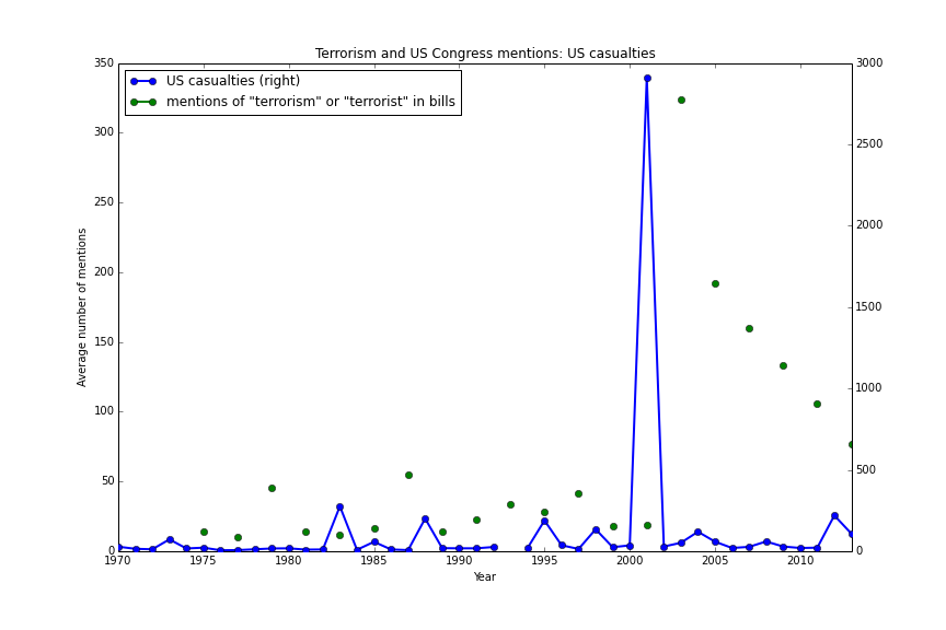
(The Congress data covers two-year intervals (as in the source), so it may seem like gaps above.)
(The Congress data covers two-year intervals (as in the source), so it may seem like gaps above.)
Wednesday, September 17, 2014
The impact of the War on Terror
You could notice that victims of terrorism increased recently. That's despite the War on Terror declared in 2001. More details come from the Global Terrorism Database (GTD):


If the War on Terror was intended to make the world safer, this graph suggests that terrorism won. But the National Strategy for Combating Terrorism had no clear numerical objectives. It addressed terrorist threats to the US, and no major terrorist attack happened in the US territories after 2001. In this sense, the War achieved something.
Other countries, however, saw more terrorism after 2001. Why? Partly, as a result of the War on Terror. Al-Qaeda itself appeared in response to the Soviet invasion of Afghanistan. And the Bush administration intended to defeat the organization nurtured by war with another war.
The strategists planned to "defeat terrorists and their organizations." It was possible to destroy the terrorist and the organizations, but new ones appeared, such as ISIS.
The Strategy did include the goal to "diminish the underlying conditions that terrorists seek to exploit." The US promised promotion of "good governance, the rule of law, respect for human rights, and professionalization of local justice systems." And also to "resolve regional disputes, foster economic, social, and political development, market-based economies, good governance, and the rule of law."
"Weak states" backfired with more fundamentalism and new opportunities for "regional disputes," such as a new Caliphate. This response is nothing new. North Korea and Vietnam resisted the US at the expense of getting more brutal rulers on the way. North Korea still has one of the strangest dictatorship in the world, and Vietnam is ruled by the same communist party that won the war against the US in 1975.
How to prevent terrorism without creating it? Maybe we knew better if some fraction of the $3-trillion war expenses went to organizations studying economic and political development. They do find workable solutions at the cost of a single Humvee. But instead, most money went to failed ideas, which ended with more human lives lost and new terrorism threats emerged.
Death toll due to terrorism increased manyfold after 2001
War on Terror coalition experienced attacks after 2001
Total death toll peaked after 2001
If the War on Terror was intended to make the world safer, this graph suggests that terrorism won. But the National Strategy for Combating Terrorism had no clear numerical objectives. It addressed terrorist threats to the US, and no major terrorist attack happened in the US territories after 2001. In this sense, the War achieved something.
Other countries, however, saw more terrorism after 2001. Why? Partly, as a result of the War on Terror. Al-Qaeda itself appeared in response to the Soviet invasion of Afghanistan. And the Bush administration intended to defeat the organization nurtured by war with another war.
The strategists planned to "defeat terrorists and their organizations." It was possible to destroy the terrorist and the organizations, but new ones appeared, such as ISIS.
The Strategy did include the goal to "diminish the underlying conditions that terrorists seek to exploit." The US promised promotion of "good governance, the rule of law, respect for human rights, and professionalization of local justice systems." And also to "resolve regional disputes, foster economic, social, and political development, market-based economies, good governance, and the rule of law."
"Weak states" backfired with more fundamentalism and new opportunities for "regional disputes," such as a new Caliphate. This response is nothing new. North Korea and Vietnam resisted the US at the expense of getting more brutal rulers on the way. North Korea still has one of the strangest dictatorship in the world, and Vietnam is ruled by the same communist party that won the war against the US in 1975.
How to prevent terrorism without creating it? Maybe we knew better if some fraction of the $3-trillion war expenses went to organizations studying economic and political development. They do find workable solutions at the cost of a single Humvee. But instead, most money went to failed ideas, which ended with more human lives lost and new terrorism threats emerged.
Tuesday, September 16, 2014
Terrorism and its mentions
Does The New York Times devote its attention proportionally to the issue? It depends on the reader. I took the fraction of articles mentioning "terrorism" and "terrorist" from from NYT Chronicle and compared it with the number of actual terrorist attacks and casualties from the Global Terrorism Database.


The last two charts show that The NYT ignores terrorist attacks in general. While terrorism casualties are at their peak, the newspaper devotes to them only 1/3 of the 9/11 volume.
More attacks, less attention
(attacks for 1993 are missing in the GTD)
Total casualties don't matter
Only casualties among US citizens matter
The last two charts show that The NYT ignores terrorist attacks in general. While terrorism casualties are at their peak, the newspaper devotes to them only 1/3 of the 9/11 volume.
Monday, September 15, 2014
Congress-speak
The New York Times evolved over time in words and topics (one, two). And so did the US Congress.
To track topics in the congressional agenda, I compared the word frequency in bill titles over the last 40 years (see Appendix for details):

Health care takes about 18% of US GDP, but the US Congress mentions it only 400 times a year in its bill titles.
 About ten times more important. But the two correlate, so one serves another in certain contexts.
 The Soviet Union appears in US Congress documents after 1991, when it ceased to exist. But China became popular around that time. The EU is less so, mainly because it's still treated as two dozens of independent states, not a single union.

Unemployment gets moderate attention (about 1/20th of "security"). Congresspersons ignore inflation, while the NYT devotes lot of attention to both and clearly prefer talking more about inflation:

To track topics in the congressional agenda, I compared the word frequency in bill titles over the last 40 years (see Appendix for details):
Education surges in the recent years, while health care does not
Security happens to be more important than freedom
China replaces the Soviet Union
Unemployment periodically becomes an issue
Unemployment gets moderate attention (about 1/20th of "security"). Congresspersons ignore inflation, while the NYT devotes lot of attention to both and clearly prefer talking more about inflation:
Appendix: Data and replication
The US Congress bill titles are available from two sources:- The Library of Congress: Bills, Resolutions
- Copy of the data on Enigma.io (registration required). An example: https://app.enigma.io/table/us.gov.congress.thomas.93.titles, where 93 refers to the 93th Congress.
Replication files: https://github.com/antontarasenko/blog-replication-files/tree/master/2014/09/15/congress_speak.
Friday, September 12, 2014
Real Limits to Growth
The Limits to Growth predicted the demise of economic growth back in 1972. Though the book received much criticism since then, Graham Turner recently confirmed that current development follows the patterns predicted by the book.
But there's one problem, which is well-known to economists in growth economics. The resource ceiling ignores technology as the capacity to switch between limited resources. The confirmatory evidences Turner found belong to the upcoming trend. Indeed, the world economy consumes more oil and food. It's okay. Bad things are supposed to happen when the economy per capita will be unable to consume more goods and services.
And the model hasn't yet confirmed these bad expectations. It's unlikely to. When some resource becomes scarcer, its price increases, and humans demand more efficient technologies, like energy-saving appliances and fuel-efficient cars. The world had an oil price shock already in the 1970s. It made better air conditioning and small cars popular even in the US.
The limit of growth comes not from too little oil, but from too much oil. Everyone invests in oil technologies for more than a century because no one sees a cheaper and more abundant resource. These investments made fossil fuels very efficient and attractive. Alternative energy can hardly compete with them.
Fossil fuels impose indirect costs, affect the environment, and crowd out investments into alternative energy. They are difficult to deal with. And their prices go down, thanks to fracking and other extraction methods.
Technologies may save the world from running out of oil, but they're themselves powerful enough to slow down development. Nuclear weapon is making troubles around for more than 60 years. Hitler nearly obtained the atomic bomb. And Germany would get it not by surprise, like a terrorist organization, but because it was one of the most developed societies in the world before the 30s. Technologies aren't safe in the hands of most advanced and democratic countries.
So, the limits to growth are trickier than the finiteness of certain resources. And these limits are less predictable.
Tuesday, September 9, 2014
Bitcoin and virtual currencies
Angel.co reports about half a thousand companies dealing with virtual currencies. CruchBase mentions 17 startups related to Bitcoin alone. Bitcoin was around for five years and attracted attention of the IT community, less of brick-and-mortar sellers and no attention of the finance industry. So, why not?
Critics' key point about the bitcoin is: it's not a currency. The plots by David Yermak:

The bitcoin's value increases over time. Great. You become richer while not spending bitcoins. Hence, very few intend to pay for things in bitcoins. Meanwhile, everyone is glad to accept bitcoins over dollars. And that's why some sellers integrated bitcoin transactions. They welcome payments in the asset whose value grows effortlessly. Especially if buyers make no adjustments for the deflation and overpay in bitcoins.

Volatility reflects risks, and the bitcoin happens to be a volatility champion among assets. Real prices nominated in fixed bitcoins fluctuate much over very short periods of time. When you have large margins or small number of transactions in bitcoins, it may not hurt. But most retailers are sensible to price changes and have to hedge the risks of even not-so-volatile currencies. Can they hedge bitcoins? Apparently, no:

Well, you don't even know what asset you should buy to protect your bitcoin holding from sudden movements.
The bitcoin may have something like the Federal Open Market Committee to maintain the exchange rate against the basket of traditional currencies. But the supply of bitcoins is restricted by design, so you can't treat it like normal money and create inflation of about 1-2% a year. At best, such a committee could avoid excessive volatility if it had sufficient volume of bitcoins under control. Then market participants would form correct expectations about the rate of deflation and would discount prices accordingly. This hypothetical central committee goes against the ideology behind the bitcoin, though.
Is it possible to design a decentralized currency that can smooth its own exchange rate movements? That's an interesting exercise about managing the monetary base in a particular way. Injecting more money doesn't move the consumer price level (or exchange rates) by itself. For example, the Fed's quantitative easing after 2008 didn't create inflation for non-financial assets also because other financial institutions preferred keeping money to spending it. You'll need helicopter money drops for deflation, at least.
That's just a hypothetical solution. Being centralized in terms of both capacities and responsibilities, any central bank is a major stakeholder for its own currency. Along with a national government, the bank is responsible for making its currency suitable for transactions and economic stability, insofar as monetary policies work. The bitcoin is an asset without a central bank. You have no stakeholder who cares about deflation and volatility. People outside the bitcoin community care little because, unlike the dollar, the bitcoin has no impact on the rest of the economy. And current holders of bitcoins must like the idea of ever-increasing value of their assets. All this hurts the bitcoin and similar virtual currencies at large.
Critics' key point about the bitcoin is: it's not a currency. The plots by David Yermak:
The bitcoin's value increases over time. Great. You become richer while not spending bitcoins. Hence, very few intend to pay for things in bitcoins. Meanwhile, everyone is glad to accept bitcoins over dollars. And that's why some sellers integrated bitcoin transactions. They welcome payments in the asset whose value grows effortlessly. Especially if buyers make no adjustments for the deflation and overpay in bitcoins.
Well, you don't even know what asset you should buy to protect your bitcoin holding from sudden movements.
The bitcoin may have something like the Federal Open Market Committee to maintain the exchange rate against the basket of traditional currencies. But the supply of bitcoins is restricted by design, so you can't treat it like normal money and create inflation of about 1-2% a year. At best, such a committee could avoid excessive volatility if it had sufficient volume of bitcoins under control. Then market participants would form correct expectations about the rate of deflation and would discount prices accordingly. This hypothetical central committee goes against the ideology behind the bitcoin, though.
Is it possible to design a decentralized currency that can smooth its own exchange rate movements? That's an interesting exercise about managing the monetary base in a particular way. Injecting more money doesn't move the consumer price level (or exchange rates) by itself. For example, the Fed's quantitative easing after 2008 didn't create inflation for non-financial assets also because other financial institutions preferred keeping money to spending it. You'll need helicopter money drops for deflation, at least.
That's just a hypothetical solution. Being centralized in terms of both capacities and responsibilities, any central bank is a major stakeholder for its own currency. Along with a national government, the bank is responsible for making its currency suitable for transactions and economic stability, insofar as monetary policies work. The bitcoin is an asset without a central bank. You have no stakeholder who cares about deflation and volatility. People outside the bitcoin community care little because, unlike the dollar, the bitcoin has no impact on the rest of the economy. And current holders of bitcoins must like the idea of ever-increasing value of their assets. All this hurts the bitcoin and similar virtual currencies at large.
Monday, September 8, 2014
Getting things done: startup edition
Publicly available startup data includes firms that exist just as online profiles. So, maybe these firms will do their product some other time or they will disappear. It's better to exclude such startups from stats and look at who survives.
Funding is a good filter here. Getting seed funding means a startup at least has a team and idea. But over the years, the fraction of series A deals decreases:

If a smaller fraction of startups gets next-stage funding, it means that fewer startups survive after getting seed money. This survival rate indicates how well startups get prepared for doing business. The fewer firms lost on the way, the lower risks investors bear.
The major startup nations from CrunchBase:

China and Israel do well here. The US makes other countries look like dwarfs on charts, so it has a separate graph:

About 80% of startups live their first to fifth funding stage. Having more stages isn't that common. By the later stages, a startup either becomes a company with more conventional funding (revenue, bank loans, bonds, public equity), or gets acquired by another company, or disappears.
Replication files: https://github.com/antontarasenko/blog-replication-files/tree/master/2014-09/08_cb_funding_stage
Funding is a good filter here. Getting seed funding means a startup at least has a team and idea. But over the years, the fraction of series A deals decreases:
If a smaller fraction of startups gets next-stage funding, it means that fewer startups survive after getting seed money. This survival rate indicates how well startups get prepared for doing business. The fewer firms lost on the way, the lower risks investors bear.
The major startup nations from CrunchBase:
China and Israel do well here. The US makes other countries look like dwarfs on charts, so it has a separate graph:
About 80% of startups live their first to fifth funding stage. Having more stages isn't that common. By the later stages, a startup either becomes a company with more conventional funding (revenue, bank loans, bonds, public equity), or gets acquired by another company, or disappears.
Replication files: https://github.com/antontarasenko/blog-replication-files/tree/master/2014-09/08_cb_funding_stage
Saturday, September 6, 2014
The century of cinema
A brief elaboration on rating systems discussed before. Since mass voting creates a skewed distribution and uses only a fraction of the scale, web services typically should avoid simple aggregation of votes.
For example, here's IMDb's famous Top 250 distributed by release decade:

The top is biased in favor of recent movies. Not least because voters themselves represent a young audience.
Compare it with film distribution from less known aggregator TSPDT:

Best films here have a normal distribution around the 1970s.
Which rating is better? Ideally, a rating system must minimize the difference between the ratings you see before and set after watching a movie. It works better when ratings can be conditioned on your preferences. (The recommender systems have the same goal, and that's what the Netflix competition was about.)
TSPDT is based on opinions by critics, and the IMDb accepts anyone's vote. Clearly, critics spend more time on comparing and evaluating cinema. But their tastes deviate from those of the public, and their ratings may be only second-best predictors of your own rating.
In politics, the role of authoritative recommenders typically belongs to journalists. And as Gentzkow et al. notice in "Competition and Ideological Diversity," people prefer like-minded newspapers. So, both journalists and critics have access only to like-minded subsets of population. And being informed helps a little in guiding others in choosing politicians and movies, unless you recommend something your reader already agree with.
But information remains an important dimension in any voting. Banerjee and Duflo, "Under the Thumb of History?", survey papers showing that voters choose other candidates when they have more information. In that sense, critics may improve everyone else's choices.
The problem may be not in information and preferences themselves, but in poor matching between experts and the public with similar preferences. Web services then may focus on improving this matching as far as they have access to both groups. Their recommender systems may advise products, but it makes sense to advise specific experts. Ratings in that case shouldn't be taken literally. They're only the mean of matching experts and subgroups of the public on issues they agree with each other.
Tuesday, September 2, 2014
Pitfalls of rating systems
A few years ago, YouTube changed its rating mechanism from five-star rating to upvote–downvote system. And it makes sense after you look at the typical distribution of ratings:

In most cases, users set either 1 or 5. That's not very informationally efficient, but it's the fact that users were reluctant to rate videos across the entire scale.
This J-shaped distribution creates problems because the mean here makes no sense. When a website reports an average rating of 3.0, it means one of two things. Either one person rated the video at 1 and another one at 5. Or both rated it at 3, which is almost never the case.
In an economy guided by ratings, the difference between these two interpretations is large and unpleasant. Since no one rates stuff around the mean, a decision based on this mean is uninformed. In the end, you watch something that you'd later rate at 1 or 5, not 3. It's like you'd ordered a steak and the waiter brought you sushi.
The worse thing about this risk is that it's implicit. Users look at ratings to reduce the risk of making a wrong choice, but instead they gamble between 1 and 5. Fortunately, the ratings aren't entirely random. They're conditioned on the stuff we observe, like gender, age, and interests. The means then may start working. Just check if those 1s and 5s were set by distinct demographic groups.
Of course, it's now about hundreds of 1s and 5s, because the degrees of freedom go down with each factor we get into the equation. How to get more ratings?
The solution is exactly what YouTube did: replace a five-star scale with a binary choice. Users don't like investing time in thinking about the proper rating, so thumbs up or down helps with decision fatigue.
More ratings allow computing the means for subgroups of users. These subratings become more relevant for those who search stuff by its rating. Though YouTube didn't make customized ratings yet, that's an option for many web services relying on user feedback.
While Uber and Fiverr can improve their rating systems by reducing it to binary choices, a scale is still a good choice for, say, IMDb. When you watch a movie for two hours, you try to rate it better than YouTube's typical three minutes. And then multiple peaks emerge for controversial movies:

You have the mean and median near to each other in a sort of Poisson distribution. The other two peaks are around radical 1 and 10. So, you need more than two grades on a scale.
Conventional hits have the YouTube pattern though:

Which again looks like the Poisson distribution with the disproportionate number of 1s.
In the end, a good rating system has to balance between the desirable number of votes and the size of the scale.
In most cases, users set either 1 or 5. That's not very informationally efficient, but it's the fact that users were reluctant to rate videos across the entire scale.
This J-shaped distribution creates problems because the mean here makes no sense. When a website reports an average rating of 3.0, it means one of two things. Either one person rated the video at 1 and another one at 5. Or both rated it at 3, which is almost never the case.
In an economy guided by ratings, the difference between these two interpretations is large and unpleasant. Since no one rates stuff around the mean, a decision based on this mean is uninformed. In the end, you watch something that you'd later rate at 1 or 5, not 3. It's like you'd ordered a steak and the waiter brought you sushi.
The worse thing about this risk is that it's implicit. Users look at ratings to reduce the risk of making a wrong choice, but instead they gamble between 1 and 5. Fortunately, the ratings aren't entirely random. They're conditioned on the stuff we observe, like gender, age, and interests. The means then may start working. Just check if those 1s and 5s were set by distinct demographic groups.
Of course, it's now about hundreds of 1s and 5s, because the degrees of freedom go down with each factor we get into the equation. How to get more ratings?
The solution is exactly what YouTube did: replace a five-star scale with a binary choice. Users don't like investing time in thinking about the proper rating, so thumbs up or down helps with decision fatigue.
More ratings allow computing the means for subgroups of users. These subratings become more relevant for those who search stuff by its rating. Though YouTube didn't make customized ratings yet, that's an option for many web services relying on user feedback.
While Uber and Fiverr can improve their rating systems by reducing it to binary choices, a scale is still a good choice for, say, IMDb. When you watch a movie for two hours, you try to rate it better than YouTube's typical three minutes. And then multiple peaks emerge for controversial movies:
You have the mean and median near to each other in a sort of Poisson distribution. The other two peaks are around radical 1 and 10. So, you need more than two grades on a scale.
Conventional hits have the YouTube pattern though:
Which again looks like the Poisson distribution with the disproportionate number of 1s.
In the end, a good rating system has to balance between the desirable number of votes and the size of the scale.
Sunday, August 31, 2014
Answering questions already answered on Stack Exchange
In one of the previous posts, the relative distribution of upvotes on Stack Exchange showed that adding one more answer to a question isn't much demanded by readers because readers give at least half of upvotes to the first-placed answer alone:

But the absolute number of upvotes tells why answers still appear:

Questions with few answers happen to be unpopular in general (that's why they have fewer answer in the first place). You can barely notice upvotes for questions with a single answer. But they grow as the graph says. The last frame describes the case of 16 answers, but it's better to be careful beyond that because the original sample has too few questions with many answers.
The bottom line is that answering a question with many answers may be more useful to users than answering questions with no answers at all. That's at least valid under the assumption of unconditional expectations. Controlling for time is the next most useful thing to do to understand how demand and supply operate in Q&A markets and what can be done to make them more efficient.
(y-axis: the answer's mean fraction of upvotes in a question; x-axis is the position of the answer)
But the absolute number of upvotes tells why answers still appear:
(y-axis: mean of upvotes; other notation is the same)
Questions with few answers happen to be unpopular in general (that's why they have fewer answer in the first place). You can barely notice upvotes for questions with a single answer. But they grow as the graph says. The last frame describes the case of 16 answers, but it's better to be careful beyond that because the original sample has too few questions with many answers.
The bottom line is that answering a question with many answers may be more useful to users than answering questions with no answers at all. That's at least valid under the assumption of unconditional expectations. Controlling for time is the next most useful thing to do to understand how demand and supply operate in Q&A markets and what can be done to make them more efficient.
Saturday, August 30, 2014
Athletes vs. data scientists
Competitions among athletes have quite a long history. Armchair sports don't. Chess, which comes to mind first, became an important sport, but only in the 20th century.
An even younger example is data-related competitions. Kaggle, CrowdANALYTIX, and HackerRank are major platforms in this case.
But do data scientists compete as furiously as athletes? Well, in some cases, yes. Here's one example:


(Source)
An even younger example is data-related competitions. Kaggle, CrowdANALYTIX, and HackerRank are major platforms in this case.
But do data scientists compete as furiously as athletes? Well, in some cases, yes. Here's one example:
(see appendix for how the datasets were constructed)
Merk and Census competitions have about the same number of participants and comparable rewards (but winners for the Census competition were restricted to US citizens only). It may seem surprising that their results look so different. I'll get back to this in the next post on data competitions.
Technically, all the competitions look alike. The lower bound is zero (minutes, seconds, errors), though only the baseline comparison makes sense. Over time, the baseline for sports declined:
(Winning time for 100m. Source.)
A two-second (-18%) improvement in 112 years.
Competitions in a single dataset look like this (more is better):
(Restricted sample taken from chmullig.com)
In general, the quality of predictions substantially increase over a few first weeks. Then marginal returns from efforts decrease. That's interesting because participants make hundreds of submissions to beat numbers three places beyond the decimal point. That's a lot of work for a normally modest monetary reward. And, well, the monetary reward makes no sense at all. A prize of $25–50K goes to winners who compete with 250 other teams. These are thousands of hours of data analysis, basically unpaid. This unpaid work doesn't sound attractive even to sponsors (hosts), which are very careful about paying for crowdsourcing. So, yes, it's a sport, not work.
Athletics has no overfitting, but that's an issue in data competitions. For example, comparison between public and private rankings for one of the competitions:
| Username | Public rank | Private rank |
| Jared Huling | 1 | 283 |
| Yevgeniy | 2 | 7 |
| Attila Balogh | 3 | 231 |
| Abhishek | 4 | 6 |
| Issam Laradji | 5 | 9 |
| Ankush Shah | 6 | 11 |
| Grothendieck | 7 | 50 |
| Thakur Raj Anand | 8 | 247 |
| Manuel Días | 9 | 316 |
| Juventino | 10 | 27 |
The public rank is computed from predictions on the public dataset. The private rank is based on a different sample unavailable before the finals. The difference is largely attributed to overfitting noisy data (and submitting best-performing random results).
In data competitions, your training is not equal to your performance. That's valid for sports as well. Athletes break world records during training sessions and then finish far away from the top in real competitions.
This has a perfectly statistical explanation, apart from psychology. In official events, the sample is smaller. A single trial, mostly. Several trials are allowed only in non-simultaneous sports, like high jumps. The sample is many times larger during training. And you're more likely to find an extreme result in a larger sample.
Anyway, though these games look like fun and games, they're also simple models for understanding complex processes. Measuring performance has value for human lives. For instance, hiring in most firms is a single-trial interview. And HR folks use simple heuristic rules for candidate assessment. When candidates are nervous, they fail their trial.
Some firms, like major IT companies, do more interviews. Not because they want to help candidates, but because they have more stakeholders whose opinion matters. But this policy increases the number of trials, so these companies hire smarter.
We don't have many counterfactuals for HR failures, but we can see how inefficient single trials are compared to multiple trials in sports.
Appendix: The data for the first graph
This graph was constructed in the following way.
First, I took the data for major competitions:
First, I took the data for major competitions:
- Athletics, 100m, men. 2012 Olympic Games in London. Link.
- Biathlon, 10km, men. 2014 Olympic Games in Sochi. Link.
- Private leaderboard. Census competition on Kaggle. Link.
- Private leaderboard. Merk competition on Kaggle. Link.
Naturally, ranking criteria are different. Minutes for biathlon, seconds for athletics, weighted mean absolute error for Census, and R^2 for Merk. All but Merk use descending ranking, when less is better. I converted metrics for Merk to descending ranking by taking ( 1 − R^2 ). That is, I ranked players in the Merk competition by the variance left unexplained by the models.
Then in each competition, I took the first place's result as 100% and converted other results as percentage of this result. After subtracting 100, I had the graph.
Tuesday, August 26, 2014
Stack Exchange and reward for being on the top
As mentioned in the previous posts, Stack Exchange has a very interpretable structure. It's a market in which demand for answering a question meets supply, and supply is paid with upvotes. Such a rude interpretation is necessary for learning how knowledge exchange works.
I once looked into a demand side of Stack Exchange, but now a few points on the supply side. In general, we are interested in efficient allocation of resources. Given the fact that sometimes one answer is enough (especially for software development questions), many answers may be a waste.
And that's the distribution of answers per question:

Well, it's a peak at 2 with a long tail. The details:
About 80 percent of questions end with five answers or less.

It says that the answer on the top have an stable advantage over all answers to a given question. You can see that after the fifth answer, adding more answers does not decrease total upvotes given to the existing answers. And the first answer gets no less that half of all upvotes.
That's a huge bonus, since multiple other answers have to split the remaining half of upvotes. That may be discouraging for participants, as competition is high and the winner takes all.
I once looked into a demand side of Stack Exchange, but now a few points on the supply side. In general, we are interested in efficient allocation of resources. Given the fact that sometimes one answer is enough (especially for software development questions), many answers may be a waste.
And that's the distribution of answers per question:
Well, it's a peak at 2 with a long tail. The details:
| number of answers | Freq. | Percent | Cum. |
| 1 | 2,123 | 18.35 | 18.35 |
| 2 | 2,601 | 22.48 | 40.83 |
| 3 | 2,138 | 18.48 | 59.3 |
| 4 | 1,458 | 12.6 | 71.9 |
| 5 | 967 | 8.36 | 80.26 |
| 6 | 674 | 5.82 | 86.09 |
| 7 | 461 | 3.98 | 90.07 |
| 8 | 325 | 2.81 | 92.88 |
| 9 | 190 | 1.64 | 94.52 |
| 10 | 135 | 1.17 | 95.69 |
About 80 percent of questions end with five answers or less.
The Reward for Being on the Top
But what's the reward for having your answer on the top of the others? These are the means of fractions of total upvotes by the position a given answer occupies:It says that the answer on the top have an stable advantage over all answers to a given question. You can see that after the fifth answer, adding more answers does not decrease total upvotes given to the existing answers. And the first answer gets no less that half of all upvotes.
That's a huge bonus, since multiple other answers have to split the remaining half of upvotes. That may be discouraging for participants, as competition is high and the winner takes all.
Sample summary statistics
| Variable | Obs | Mean | Std. Dev. | Min | Max |
| upvotes | 45463 | 5.390141 | 24.11624 | 0 | 1553 |
| downvotes | 45463 | 0.1868992 | 0.9164532 | 0 | 82 |
| net (up - down) | 45463 | 5.203242 | 23.94713 | -19 | 1552 |
| position | 45463 | 4.449794 | 6.709625 | 1 | 114 |
| total_answers | 45463 | 7.899589 | 10.94102 | 1 | 114 |
| relative position | 45463 | 0.6272573 | 0.2922457 | 0.0087719 | 1 |
| total_uv_b~q | 45463 | 67.75934 | 221.0013 | 0 | 2488 |
| frac_uv | 44188 | 0.2440255 | 0.3074606 | 0 | 1 |
Monday, August 25, 2014
NYT-speak continued
The New York Times' choice of words tells much about history and the media. As seen before, their Chronicle shows great snapshots of the newspaper's wording evolution.
Here, a few more cases.


Though in general money and knowledge move in the same directions, money moves in greater magnitudes. Also, notice that in the Great Depression, as well as in the Great Recession, the NYT mentioned money less frequently. And the opposite happened during stagflation in the 70s.

Inequality never was an issue for the NYT. Even in the late 20s, when inequality was extremely high. So, it's a new topic. Meanwhile, previous mentions of equality are generally associated with civil rights movements, as in the 60s.

At its peak, war themes took up to 30% of the newspaper materials. But local wars, like Iraq and Afghanistan, never draw so much attention.

A similar graph was in the previous post, but here changes in wording are clearer. Especially right after the Civil War, when politicians no longer needed support from the black population, and one hundred years later, when politicians and media had to update their vocabulary.

Here, a few more cases.
Information sourcing
As Robert Fisk once noted, the media now rely more on what officials said, rather than sourcing news by themselves. That's a confirmation:
Money and knowledge in crises
Though in general money and knowledge move in the same directions, money moves in greater magnitudes. Also, notice that in the Great Depression, as well as in the Great Recession, the NYT mentioned money less frequently. And the opposite happened during stagflation in the 70s.
Inflation and unemployment
Mentions of unemployment and inflation went in different directions before the 70s: right until the economy happened to have both. But it was a short period and right now there're no mutual relations (at least, in wording).
In- and equality
Inequality never was an issue for the NYT. Even in the late 20s, when inequality was extremely high. So, it's a new topic. Meanwhile, previous mentions of equality are generally associated with civil rights movements, as in the 60s.
"Make war, not love"
Referring to minorities
A similar graph was in the previous post, but here changes in wording are clearer. Especially right after the Civil War, when politicians no longer needed support from the black population, and one hundred years later, when politicians and media had to update their vocabulary.
Sports becoming more popular
Saturday, August 23, 2014
Top 1% on Stack Exchange, or inequality in Q&A markets
Yesterday's review of voting activity showed how Stack Exchange users evaluate each others' contributions. Contrary to some views, users don't go berserk despite anonymity and in general balance their judgment.
Upvotes are a currency in a moneyless economy, like one of Stack Exchange. It doesn't mean people do things for upvotes. In this survey, reciprocity comes first as motivation, while upvotes lag behind. But, like money, upvotes often measure one's contribution to the community. Though it's in unlimited supply, upvoting has its own costs (yes, costs of clicking on buttons), and can measure something. For instance, inequality.

The long tail is wagging behind, but the inequality is very high.
The Gini coefficient for Stack Exchange is 0.85 for upvotes. That's higher than in South Africa (0.63), which has the highest inequality among countries.


Upvotes are a currency in a moneyless economy, like one of Stack Exchange. It doesn't mean people do things for upvotes. In this survey, reciprocity comes first as motivation, while upvotes lag behind. But, like money, upvotes often measure one's contribution to the community. Though it's in unlimited supply, upvoting has its own costs (yes, costs of clicking on buttons), and can measure something. For instance, inequality.
Gini
Here's the distribution of upvotes that a particular user got over time:The long tail is wagging behind, but the inequality is very high.
The Gini coefficient for Stack Exchange is 0.85 for upvotes. That's higher than in South Africa (0.63), which has the highest inequality among countries.
Top 1% and 0.1%
High inequality leads to the questions what does top 1% of users own. Well, they own 42.8% of all upvotes. Actually, it's just about the same percentage that the 1% of richest Americans now control in the national economy.
Top 0.1% users own 15.4% of all upvotes.
Also, Pareto's law nearly holds. Top 20% of users own 87.7% of upvotes.
How to get rich in this economy
In brief: by being rich. This is why:
(users with less than 10 votes in total are excluded as bypassers)
Until you earn about ten upvotes, the only thing that grows is your downvotes. That's a mentoring stage when novices are downvoted as someone who do not read rules. But after you accumulated this minimum, upvotes grow relatively to downvotes. And they grow rapidly.
This result is robust to including bypassers back in the sample (see how the line changes the slope at ln(downvotes) ≈ 2):
So, in general, you have more when you already have enough.
Data Appendix
Analysis is done with a 1% sample of users. Data is available at data.stackexchange.com, while replication files will soon be posted online.
Subscribe to:
Comments (Atom)